Arting for 365 Day 172: In Gold We Move Along

I’ve been lucky enough to have some really incredible bosses over the years. So a few days ago when my former boss, and all around great lady, called to see if I’d be willing to head to Crested Butte to help her son out with his clinic, I was more than happy to do so.

I spent much of yesterday packing – both my suitcase and bins to take over to Gertie. As some of you may recall, Gertie is our new/used RV that we will be well on our way to being moved into upon my return.

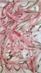
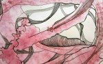
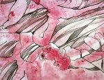
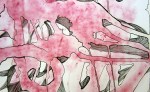
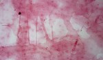
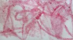
As I loaded up clothes, I realized my mess of art supplies should also probably be organized, at least to some extent, to make moving a bit easier.  As I sifted through odds and ends I came across some textured, gold paper. The paper is a bit over the top and actually reminds me of a prom dress my sister had in high school (early 90s). I decided the textured find would be perfect to use for day 172’s piece.

I was able to wind down and have a lot of fun creating these two pieces before heading off for my new adventure high in the Rocky Mountains.

Arting for 365 Day 171: Cut Paper – Celebration

Day 171 (10/16/12): Cut Out  - Celebration

8 x 10″ Layered Cut Outs

Some friends of ours are getting married this weekend. It should be a gorgeous fall wedding as golds, oranges and reds are still hanging tightly to most of the trees.

I think that all of our friends have come to realize that if there is a present to be got, they will be getting art from us. This occasion is no different.

Awhile back we received our invitation to the celebration. It was a 5 x 7″ card in pink and dark brown, with dark brown backing. Upon seeing it I realized I could create some sort of a cut paper design from the card as our gift to them. I wanted to create something that was a piece of art while also reminding them of their big day. Initially the piece had a different backing with much more cut out, but it seemed too ornate. The softness of the pink and the lettering along with all of the curved cut outs was just too much. I opted to back it instead on black and keep the cutouts to a minimum, which I think was much more successful.

There was one thing I neglected to think through with this piece. The boyfriend asked what time the wedding starts on Saturday and I couldn’t tell him. Turns out I cut that part out. 

Arting for 365 Day 170: Self Portrait in Shadow

Day 170 (10/15/12): Self Portrait From Shadow

8 x 10″ Watercolor and ink on paper

Goal: To create one piece of art each day for 365 consecutive days

As I readied myself to work on yesterday’s piece, the sky became filled with an amazing light. I got up and looked out the window. The edges of clouds glowed and there seemed to be a hazy calm across everything. It lasted only a few minutes but was spectacular.

Perhaps taking the time to stop and watch the light outside was the reason for my noticing my simple shadow when I sat back down. My head’s shape filled the blank piece of paper and I was immediately taken by it. Perhaps it was the vagueness of the silhouette that I was so drawn to. The only telling sign it might be me were the ears fanning out prominently. Whatever it was, I was certain I wanted to capture the shadow in that moment.

The resulting piece is this calm, flowing, abstract piece.

Work is available for purchase at https://www.etsy.com/listing/112319722/portrait-in-shadow-abstract-watercolor

Arting for 365 Day 169: Foliage, Geometry and Photoshop

Day 169 (10/14/12): Foliage II in Blue and GreenGoal: To create one piece of art each day for 365 consecutive days

Another attempt at “painting” in Photoshop. My yesterday’s claim that “I’ve enjoyed it”  is being edited to -“Oh my gosh this was so tedious it just about killed me.”

I must remind myself that a challenge is good for me. I’m certain of it…

This is bound to get easier with practice though, right?

Original 8.5″ x 11″ Ink on paper

Arting for 365 Day 168: Stinger

Day 168 (10/13/12): StingerGoal: To create one piece of art each day for 365 consecutive days

Lately I’ve been uploading my original drawings and messing around with them in Photoshop. I don’t typically plant myself in front of a computer when making art. As a matter of fact, it is the farthest thing from how I prefer to create. So I’m not sure why I thought this sounded like a good idea – perhaps it was my subconscious telling me I better figure out an art that can be done in our tiny new RV space. At any rate, this has been a new adventure for me and I’m shocked to admit I’ve enjoyed it.

The process does take MUCH longer as I am not yet a whiz when it comes to drawing with a stylus and tablet (I’ve got a little Wacom). It takes some getting used to – drawing onto something whose marks are only seen on the computer screen. But because the new skill has yet to come easy for me, it pushes my brain a bit – which is always good. The other super thing about creating this way is that Photoshop allows me to create layers. This means that once I have finished up the painting – putting each color on a separate layer, I am basically magic in my ability to easily change those colors as I like.

This is probably as close to embracing technology when making art as I get.

3 x 5″ Original Drawing

Arting for 365 Day 166: Beet Again

Day 166 (10/11/12): Beet Again

13 x 23.25″ Beet pigment and ink on paper

I have heard many a folk proclaim that beets taste like dirt. Nonsense, I say. I love the beet – pickled, raw, roasted – doesn’t matter to me, it’s all delicious. So after using the slices of beets in day 163’s project, I decided I’d boil them along with the whole beets we had, to make something delicious. As the water turned a lovely shade of purple, I realized I could use it for another beet project.

Using a turkey baster, I sucked up the juice and squirted it onto a 13 x 23.25″ sheet of paper. Sadly, the results were hardly noticeable. In the pot, the liquid appeared rich in color, but upon squirting I realized it was really watered down and made a pathetic stain that you had to strain your eyes to see. Now though, I was fixated on creating a beet piece and my excitement for eating the veggies disappeared. I grabbed one of the newly cooked beets and began drawing with it on the paper as though it were sidewalk chalk. As I did so, I realized the pigment was pulling out the original squirted on design. I rubbed more of the deep purple vegetable over where I had originally squirted the water, pulling out the underlying lines and shapes that now appeared almost raised (see below).

From here, I grabbed my trusty pens and started drawing. I outlined the shapes and some of the bits of vegetable that had stuck to the paper. I then began incorporating patterns of lines. As I was building the design up, it really looked like human innards. Intestines here, a heart there – but as I continued to add flowing lines, the innards became less apparent (although I still see them) and the flowing paths became stronger.

I am quite fond of the piece. It has depth and movement and I am fascinated with the process of creating in this manner – where one step directs the next.

As a side note, I had few beets left over that I did get to enjoy in a yummy salad.

You can buy this fun piece if you’d like!

Arting for 365 Day 164: Beet Juice, Lines and Cuts

11 x 14″ Beet juice, ink, and cut paper

Using natural pigments to create work is something I’ve experimented with in the past. Pomegranates, blueberries, raspberries – they all have a lovely color that stains paper really nicely. So yesterday, after a friend had left some beets for us, I was excited to create a piece using beet pigment.

Inspired by day 163’s piece in which I created drawings by finding pattern in the paint, I hoped to explore a similar path for yesterday’s work. I started the process by pushing beets onto paper in order to create the initial design. From there, the stains would act as the base on which my ink drawing would build from – working around the stains on the paper. Once the drawing was created, I cut the paper, working within and around the ink drawing. One step in the process therefore directed the next step.

The result is a delicate 11 x 14″ piece whose sequential steps were integral to it’s development as a finished work. On top of that I really like the combination of soft color, hard edged cuts and organic lines.

Arting for 365 Day 163: Repetition, Design, Bottle Caps

Day 1163 (10/8/12): Repetition, Design, Bottlecaps

13.5 x 7.5 (including frame) Bottle caps, ink and paint

Goal: To create one piece of art each day for 365 consecutive days

We had been collecting bottle caps for some friends of ours to use. They had planned to decorate costumes with them for an event that takes place here in September, but as the date of the event rolled around, they ended up not needing them. Upon realizing I had a collection of bottle caps to use to my liking, I brainstormed ways to incorporate them into one of my daily works. This piece is what I came up with.

I started with the caps and a bad framed art print that I had picked up from a box labeled “free” in the hood one day. After gluing each cap onto the glass, I painted a layer of white over each. Initially I created whatever design I felt like, but as I looked more closely, I noticed that my paint application had created interesting patterns. I immediately switched gears and began to create designs based on the natural patterns in the paint.

While I think I would leave more of the bottle caps showing next round, I do really enjoy this piece. The repetition of the caps draws me in and because each design is unique I want to continue to look at it. I think the misshaped bottle caps packed tightly together within a frame that is a bit gaudy and 80s looking is odd and humorous. I definitely want to create another one of these, which means I will have to drink more beer. Oh the sacrifices I make for the sake of art.

If you like this piece, you can buy it!